AI Integration · Data Science
EDA With Scatter Plots and Lines of Best Fit
Perform EDA on the Boston Housing dataset using scatter plots and regression lines to identify relationships between features and housing prices.

Anurag Verma
3 min read

Sponsored
The Boston Housing dataset contains information about housing in the suburbs of Boston. The data includes 13 features, such as crime rate, the average number of rooms per dwelling, and the pupil-teacher ratio, as well as the target variable MEDV, which represents the median value of owner-occupied homes in $1000s.
Why scatter plots first
To understand the relationships between the features and the target variable, we can use scatter plots. A scatter plot is a visualization tool that displays two variables as points on a graph. The position of each point represents the values of the two variables. This allows us to see if there is any correlation or relationship between the two variables.
The code
To create scatter plots for each feature in the Boston Housing dataset, we can use the following code:
import pandas as pd
import numpy as np
import matplotlib.pyplot as plt

# load the data
df = pd.read_csv('boston_house_price.csv')

# create a figure and axis for the scatter plots
fig, axs = plt.subplots(13, 1, figsize=(25, 100))
axs = axs.ravel()

# plot each feature against the target variable
for i, column in enumerate(df.columns[:-1]):
    axs[i].scatter(df[column], df["MEDV"])
    axs[i].set_title(column)
    axs[i].set_xlabel(column)
    axs[i].set_ylabel("MEDV")

    # calculate the slope and intercept of the line of best fit
    slope, intercept = np.polyfit(df[column], df["MEDV"], 1)
    x = np.linspace(df[column].min(), df[column].max(), 100)
    y = slope * x + intercept

    # plot the line of best fit
    axs[i].plot(x, y, '-r')

plt.show()
What the code is doing
The first thing we do is load the data from the CSV file using pandas. We then create a figure and axis for the scatter plots using the subplots function. We set the size of the figure to 25 by 100 inches, and use the ravel function to convert the axis object into a 1D array.
We then loop through each feature in the dataset (except for the target variable), and create a scatter plot with that feature on the x-axis and the target variable MEDV on the y-axis. We also set the title, x-label, and y-label for each plot.
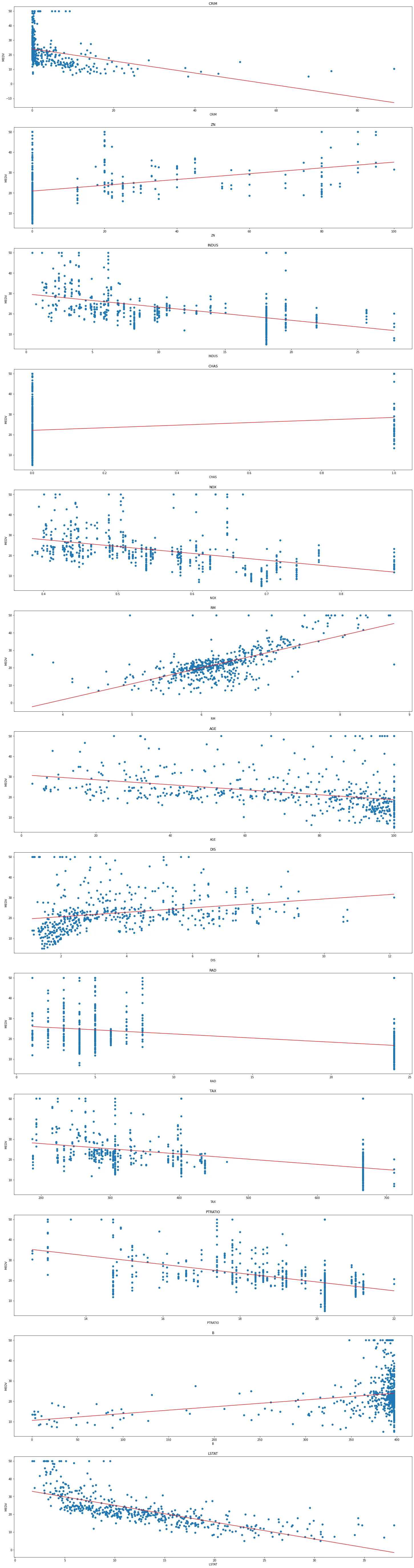
To visualize the relationship between the feature and the target variable, we also calculate and plot a line of best fit. This is done by calculating the slope and intercept of the line using NumPy’s polyfit function, and then creating a range of x-values using NumPy’s linspace function. We then calculate the corresponding y-values and plot the line using Matplotlib’s plot function.
When we run this code, we get 15 scatter plots, each showing the relationship between a feature and the target variable MEDV. Here’s what it looks like:
Reading the result
From these scatter plots, we can see that there are some features that are strongly correlated with the target variable, such as RM and LSTAT. We can also see that some features have a weak or no correlation with the target variable, such as ZN and CHAS.
The takeaway
In conclusion, scatter plots are a valuable tool for visualizing the relationships between features and target variables in a dataset. With Python, we can easily create scatter plots for each feature in the Boston Housing dataset and gain insights into the data.
Frequently asked questions
- Why plot every feature against the target before modelling?
- Because it costs one loop and tells you what to expect. You find out which features have a visible relationship, whether that relationship is straight or curved, whether outliers dominate, and whether a feature is effectively constant. All of that changes your modelling choices, and finding it after fitting a model means you spend the debugging time wondering why the coefficients look strange.
- What does the line of best fit actually add?
- It makes the direction and rough strength of a linear relationship visible at a glance across many small plots, which matters when you are scanning fifteen panels rather than studying one. What it does not do is validate anything. A straight line drawn through curved data still looks like a line, and a single extreme point can swing it noticeably, so treat it as a reading aid rather than evidence.
- Should I still use the Boston Housing dataset?
- Not for new work. scikit-learn deprecated it in 1.0 and removed it in 1.2, because the dataset includes a feature built on an assumption about the racial composition of neighbourhoods affecting house prices, which is not something to reproduce in teaching material. California Housing ships with scikit-learn and works for the same regression examples; Ames Housing is the usual substitute when you want richer feature engineering.
- What does a weak scatter plot actually rule out?
- Less than people assume. It rules out a strong simple relationship between those two variables on their own. It does not rule out the feature mattering in combination with others, being important only within a subgroup, or having a relationship the plot's scale is hiding. Dropping a feature because one scatter plot looks like noise is a common way to lose signal, so treat weak plots as a prompt to check further rather than a decision.
- Why set such a large figure size?
- Because fifteen subplots in a default-sized figure are unreadable. The size here is chosen so each panel is large enough to see individual points and the axis labels, at the cost of a very tall image. If you are working in a notebook and only care about a handful of features, plotting fewer panels at a normal size is more practical than scrolling through a poster.
Sponsored
More from this category
More from AI Integration
Sponsored
Discussion
Join the conversation.
Comments are powered by GitHub Discussions. Sign in with your GitHub account to leave a comment.
Sponsored