Design · Accessibility
Accessibility in 2026 — A Developer's Guide to WCAG Compliance
Web accessibility is legally required and ethically essential. Here's a practical guide to building accessible applications with WCAG 2.2 compliance.

Anurag Verma
9 min read

Sponsored
Accessibility is not optional. In 2026, web accessibility lawsuits continue to rise, regulatory requirements are expanding, and (most importantly) 1 billion people worldwide live with disabilities. Building accessible products is both a legal requirement and the right thing to do.
This guide covers practical accessibility implementation for web developers.
Accessible design benefits everyone, not just users with disabilities
Understanding WCAG
WCAG (Web Content Accessibility Guidelines) is the international standard for web accessibility, published by the W3C. It organizes requirements around four principles, Perceivable, Operable, Understandable, and Robust, known as POUR, and three conformance levels: A (minimum), AA (the level most regulations require), and AAA (enhanced). The full text lives in the official WCAG 2.2 reference.
WCAG 2.2 Structure
WCAG is organized around four principles (POUR):
| Principle | Meaning |
|---|---|
| Perceivable | Information must be presentable in ways users can perceive |
| Operable | Interface components must be operable by all users |
| Understandable | Information and UI operation must be understandable |
| Robust | Content must be robust enough to work with assistive technologies |
Conformance Levels
| Level | Description | Required For |
|---|---|---|
| A | Minimum accessibility | Basic compliance |
| AA | Standard accessibility | Most regulations (ADA, EU) |
| AAA | Enhanced accessibility | Specialized applications |
Target Level AA. It covers most accessibility needs and is the regulatory standard.
Practical Implementation
Semantic HTML
Use the right HTML elements. This solves 50% of accessibility issues:
<!-- Bad: div-based navigation -->
<div class="nav">
  <div class="nav-item" onclick="navigate('/home')">Home</div>
</div>

<!-- Good: semantic navigation -->
<nav aria-label="Main navigation">
  <ul>
    <li><a href="/home">Home</a></li>
  </ul>
</nav>
Key semantic elements:
| Element | Purpose |
|---|---|
<header> | Page or section header |
<nav> | Navigation links |
<main> | Main content |
<article> | Self-contained content |
<section> | Thematic grouping |
<aside> | Tangentially related content |
<footer> | Page or section footer |
<button> | Clickable actions |
<a> | Navigation links |
Keyboard Navigation
All functionality must be keyboard accessible:
// Component with keyboard support
function Dropdown({ items, onSelect }) {
  const [activeIndex, setActiveIndex] = useState(0)
  const [isOpen, setIsOpen] = useState(false)

  const handleKeyDown = (e: KeyboardEvent) => {
    switch (e.key) {
      case 'ArrowDown':
        e.preventDefault()
        setActiveIndex(prev => Math.min(prev + 1, items.length - 1))
        break
      case 'ArrowUp':
        e.preventDefault()
        setActiveIndex(prev => Math.max(prev - 1, 0))
        break
      case 'Enter':
      case ' ':
        e.preventDefault()
        onSelect(items[activeIndex])
        setIsOpen(false)
        break
      case 'Escape':
        setIsOpen(false)
        break
    }
  }

  return (
    <div role="listbox" onKeyDown={handleKeyDown}>
      {items.map((item, index) => (
        <div
          key={item.id}
          role="option"
          aria-selected={index === activeIndex}
          tabIndex={index === activeIndex ? 0 : -1}
        >
          {item.label}
        </div>
      ))}
    </div>
  )
}
Keyboard requirements:
- All interactive elements must be focusable
- Focus order must be logical
- Focus indicator must be visible
- No keyboard traps (user can always navigate away)
ARIA (When Needed)
ARIA supplements HTML when semantics are not enough:
<!-- Custom dropdown needs ARIA -->
<button
  aria-haspopup="listbox"
  aria-expanded="true"
  aria-controls="dropdown-list"
>
  Select option
</button>

<ul
  id="dropdown-list"
  role="listbox"
  aria-label="Options"
>
  <li role="option" aria-selected="true">Option 1</li>
  <li role="option" aria-selected="false">Option 2</li>
</ul>
ARIA rules:
- Do not use ARIA if native HTML works
- All interactive ARIA elements need keyboard support
- Never change native semantics unnecessarily
- All ARIA controls need accessible names
Color and Contrast
WCAG requires minimum contrast ratios:
| Content | Ratio (AA) | Ratio (AAA) |
|---|---|---|
| Normal text | 4.5:1 | 7:1 |
| Large text (18pt+) | 3:1 | 4.5:1 |
| UI components | 3:1 | N/A |
/* Bad: low contrast */
.text {
  color: #999999;  /* 2.85:1 on white - fails AA */
}

/* Good: sufficient contrast */
.text {
  color: #595959;  /* 7:1 on white - passes AAA */
}
Tools: Use contrast checkers in your design tools or browser DevTools, or the newer CSS contrast-color() function covered in our CSS contrast guide.
Images and Media
Provide text alternatives:
<!-- Informative image -->
<img
  src="chart.png"
  alt="Sales increased 25% from Q1 to Q2 2026"
/>

<!-- Decorative image -->
<img
  src="decorative-border.png"
  alt=""
  role="presentation"
/>

<!-- Complex image with detailed description -->
<figure>
  <img
    src="complex-diagram.png"
    alt="System architecture overview"
    aria-describedby="diagram-description"
  />
  <figcaption id="diagram-description">
    The system consists of three layers: presentation (React),
    API (Node.js), and data (PostgreSQL). Traffic flows through
    a load balancer to multiple API instances...
  </figcaption>
</figure>
Video requirements:
- Captions for deaf/hard of hearing users
- Audio descriptions for blind users
- Transcripts for all users
Forms
Forms are common accessibility failure points:
<!-- Accessible form -->
<form>
  <div class="form-group">
    <label for="email">
      Email address
      <span aria-hidden="true">*</span>
    </label>
    <input
      id="email"
      type="email"
      required
      aria-required="true"
      aria-describedby="email-hint email-error"
    />
    <span id="email-hint" class="hint">
      We'll never share your email
    </span>
    <span id="email-error" class="error" role="alert">
      Please enter a valid email address
    </span>
  </div>

  <fieldset>
    <legend>Notification preferences</legend>
    <div>
      <input type="checkbox" id="email-notifications" />
      <label for="email-notifications">Email notifications</label>
    </div>
    <div>
      <input type="checkbox" id="sms-notifications" />
      <label for="sms-notifications">SMS notifications</label>
    </div>
  </fieldset>

  <button type="submit">Save preferences</button>
</form>
Form requirements:
- Every input has a visible label
- Labels are programmatically associated (for/id)
- Error messages are clear and announced
- Required fields are indicated
- Group related inputs with fieldset/legend
Focus Management
Manage focus for dynamic content:
// Modal focus management
function Modal({ isOpen, onClose, children }) {
  const modalRef = useRef<HTMLDivElement>(null)
  const previousFocus = useRef<HTMLElement | null>(null)

  useEffect(() => {
    if (isOpen) {
      // Store current focus
      previousFocus.current = document.activeElement as HTMLElement
      // Move focus to modal
      modalRef.current?.focus()
    } else {
      // Restore focus when closing
      previousFocus.current?.focus()
    }
  }, [isOpen])

  if (!isOpen) return null

  return (
    <div
      ref={modalRef}
      role="dialog"
      aria-modal="true"
      aria-labelledby="modal-title"
      tabIndex={-1}
    >
      <FocusTrap>
        <h2 id="modal-title">Modal Title</h2>
        {children}
        <button onClick={onClose}>Close</button>
      </FocusTrap>
    </div>
  )
}
Live Regions
Announce dynamic content to screen readers:
<!-- Polite announcement (waits for pause) -->
<div aria-live="polite" aria-atomic="true">
  Item added to cart
</div>

<!-- Assertive announcement (interrupts) -->
<div role="alert">
  Error: Payment failed. Please try again.
</div>

<!-- Status updates -->
<div role="status">
  Loading... 50% complete
</div>
Testing Accessibility
Automated Testing
Automated tools catch ~30% of issues:
If you’re already running end-to-end tests, our Playwright testing guide covers the setup this builds on.
# axe-core with Playwright
npm install @axe-core/playwright

# In tests
import { injectAxe, checkA11y } from 'axe-playwright'

test('homepage is accessible', async ({ page }) => {
  await page.goto('/')
  await injectAxe(page)
  await checkA11y(page)
})
Tools:
- axe-core (browser extension, CI integration)
- Lighthouse (Chrome DevTools)
- WAVE (browser extension)
- pa11y (command line)
Manual Testing
Automated testing is not enough:
Keyboard testing:
- Tab through entire page
- Verify focus is visible
- Verify all interactions work without mouse
- Check for keyboard traps
Screen reader testing:
- VoiceOver (macOS, iOS)
- NVDA (Windows, free)
- JAWS (Windows, paid)
Other checks:
- Zoom to 200%: does content reflow?
- Disable CSS: does content make sense?
- Check color contrast
- Verify heading hierarchy
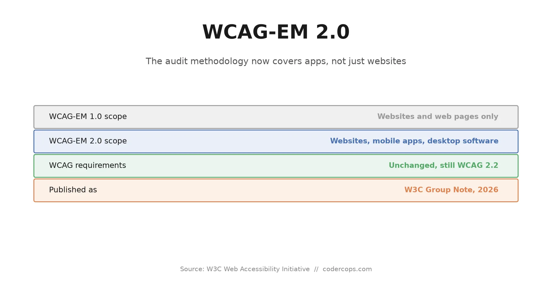
For mobile apps specifically, our WCAG-EM 2 evaluation guide walks through a structured methodology rather than ad hoc spot checks.
Accessibility Audit Checklist
| Category | Check |
|---|---|
| Structure | Semantic HTML used |
| One h1 per page | |
| Logical heading hierarchy | |
| Landmarks present (main, nav, etc.) | |
| Keyboard | All elements focusable |
| Focus visible | |
| No keyboard traps | |
| Skip link present | |
| Images | Alt text for informative images |
| Decorative images marked | |
| Forms | Labels associated |
| Errors announced | |
| Required fields indicated | |
| Color | Contrast ratios met |
| Information not color-only | |
| Motion | Respects prefers-reduced-motion |
| No auto-playing media |
Component Patterns
Skip Link
<body>
  <a href="#main-content" class="skip-link">
    Skip to main content
  </a>
  <nav>...</nav>
  <main id="main-content" tabindex="-1">
    ...
  </main>
</body>

<style>
.skip-link {
  position: absolute;
  left: -9999px;
}
.skip-link:focus {
  left: 0;
  z-index: 9999;
  background: white;
  padding: 1rem;
}
</style>
Accessible Tabs
function Tabs({ tabs }) {
  const [activeTab, setActiveTab] = useState(0)

  return (
    <div>
      <div role="tablist" aria-label="Content tabs">
        {tabs.map((tab, index) => (
          <button
            key={tab.id}
            role="tab"
            id={`tab-${tab.id}`}
            aria-selected={index === activeTab}
            aria-controls={`panel-${tab.id}`}
            tabIndex={index === activeTab ? 0 : -1}
            onClick={() => setActiveTab(index)}
          >
            {tab.label}
          </button>
        ))}
      </div>
      {tabs.map((tab, index) => (
        <div
          key={tab.id}
          role="tabpanel"
          id={`panel-${tab.id}`}
          aria-labelledby={`tab-${tab.id}`}
          hidden={index !== activeTab}
        >
          {tab.content}
        </div>
      ))}
    </div>
  )
}
Making It Sustainable
Build Accessibility Into Process
- Design phase: Accessibility review of mockups
- Development: Use accessible components, write semantic HTML
- Code review: Check for accessibility issues
- Testing: Automated + manual accessibility tests
- QA: Include accessibility in test plans
Use Accessible Component Libraries
Start with components that handle accessibility:
- Radix UI
- Headless UI
- React Aria
- Chakra UI
These provide keyboard support, ARIA, and focus management out of the box — see our breakdown of shadcn/ui, which builds directly on Radix primitives, for one example.
Educate Your Team
Accessibility is everyone’s responsibility:
- Designers (who you hire matters here): Color contrast, focus states, touch targets
- Developers: Semantic HTML, keyboard support, ARIA
- QA: Testing with assistive technologies
- Content: Clear writing, alt text, captions
The Bottom Line
Accessibility is not a feature. It is a quality standard. Just as you would not ship code that crashes for some users, you should not ship code that is unusable for users with disabilities.
Start with semantic HTML. Test with a keyboard. Run automated scans. Gradually expand your skills. Perfect accessibility is a journey, but every step makes your product usable by more people.
Frequently asked questions
- What does WCAG stand for and what conformance level should I target?
- WCAG stands for Web Content Accessibility Guidelines, the W3C's international standard for web accessibility. Target Level AA — it covers most accessibility needs and is the level referenced by most regulations, including the ADA and EU accessibility law. Level AAA is for specialized applications, and Level A alone is not enough for most compliance requirements.
- How much of accessibility can semantic HTML alone fix?
- Roughly 50% of accessibility issues, by using the right element for the job instead of a generic `<div>` with a click handler. A `<nav>`, `<button>`, or `<main>` element gets you keyboard focusability, screen-reader landmarks, and correct semantics automatically, without writing any ARIA.
- When should I use ARIA attributes instead of native HTML?
- Only when native HTML genuinely can't express what you need, like a custom dropdown or tab interface. The core rules: don't use ARIA if native HTML already works, give every interactive ARIA element keyboard support, never override native semantics unnecessarily, and make sure every ARIA control has an accessible name.
- Is automated accessibility testing enough on its own?
- No. Automated tools like axe-core, Lighthouse, and WAVE catch only about 30% of accessibility issues. You also need manual keyboard testing (tab through the whole page, check focus visibility, look for keyboard traps) and screen reader testing with tools like VoiceOver, NVDA, or JAWS to catch what automation misses.
- What contrast ratio does WCAG require for text?
- For Level AA, normal text needs a 4.5:1 contrast ratio against its background, while large text (18pt and up) and UI components need 3:1. Level AAA raises normal text to 7:1 and large text to 4.5:1. A contrast checker in your design tool or browser DevTools will tell you the exact ratio for any color pair.
Sponsored
More from this category
More from Design

Sponsored
Discussion
Join the conversation.
Comments are powered by GitHub Discussions. Sign in with your GitHub account to leave a comment.
Sponsored