

Sponsored
Mobile traffic has dominated for years, yet many developers still design for desktop first and adapt down. In 2026, mobile-first is not just about CSS breakpoints. It is about designing for the constraints and capabilities of mobile devices from the start.
The evolution: responsive design handles screen sizes. Adaptive design handles device capabilities, user preferences, and context.
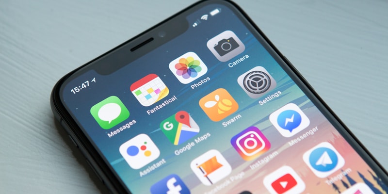
The Mobile Landscape in 2026
| Metric | Value |
|---|---|
| Mobile web traffic | ~60% of global traffic |
| Mobile e-commerce | ~70% of online purchases |
| Average mobile session | 3-5 minutes |
| Mobile-only internet users | ~4 billion globally |
Designing for desktop first means designing for the minority.
Mobile-First CSS
Start with mobile styles, add complexity for larger screens:
/* Mobile-first approach */

/* Base styles (mobile) */
.container {
  padding: 1rem;
  display: flex;
  flex-direction: column;
  gap: 1rem;
}

.card {
  width: 100%;
  padding: 1rem;
}

/* Tablet and up */
@media (min-width: 768px) {
  .container {
    flex-direction: row;
    flex-wrap: wrap;
    padding: 2rem;
  }

  .card {
    width: calc(50% - 0.5rem);
  }
}

/* Desktop and up */
@media (min-width: 1024px) {
  .container {
    max-width: 1200px;
    margin: 0 auto;
  }

  .card {
    width: calc(33.333% - 0.67rem);
  }
}
Why Mobile-First Works
| Approach | Result |
|---|---|
| Desktop-first | Override complex styles for mobile (more CSS, harder maintenance) |
| Mobile-first | Add complexity progressively (less CSS, cleaner code) |
Mobile-first CSS is leaner because mobile styles are simpler: no multi-column layouts, smaller spacing, simpler navigation.
Modern CSS for Responsive Design
Container Queries
Style based on container size, not viewport:
.card-container {
  container-type: inline-size;
  container-name: card;
}

.card {
  display: flex;
  flex-direction: column;
}

@container card (min-width: 400px) {
  .card {
    flex-direction: row;
  }
}
Container queries enable truly modular components that adapt to their context. See our container queries in production guide for browser support details and more real-world patterns.
CSS Grid Auto-Fit
Let the browser handle column counts:
.grid {
  display: grid;
  grid-template-columns: repeat(auto-fit, minmax(300px, 1fr));
  gap: 1rem;
}
No media queries needed. Cards fill available space automatically.
Fluid Typography
Scale text smoothly across screen sizes:
/* Using clamp() for fluid typography */
h1 {
  font-size: clamp(1.5rem, 4vw, 3rem);
  /* min: 1.5rem, preferred: 4vw, max: 3rem */
}

p {
  font-size: clamp(1rem, 2.5vw, 1.125rem);
}
Logical Properties
Support different writing modes:
/* Physical properties (LTR-centric) */
.card {
  margin-left: 1rem;
  padding-right: 1rem;
  border-bottom: 1px solid;
}

/* Logical properties (writing-mode agnostic) */
.card {
  margin-inline-start: 1rem;
  padding-inline-end: 1rem;
  border-block-end: 1px solid;
}
Adaptive Design
Beyond screen size, adapt to device capabilities:
Hover vs Touch
/* Touch devices: larger tap targets, no hover effects */
.button {
  padding: 0.75rem 1.5rem;
  min-height: 44px; /* iOS touch target */
  min-width: 44px;
}

/* Hover-capable devices: add hover effects */
@media (hover: hover) {
  .button:hover {
    background-color: var(--color-primary-dark);
    transform: translateY(-1px);
  }
}
Reduced Motion
Respect user preferences:
/* Default: include animations */
.modal {
  animation: slideIn 300ms ease-out;
}

/* Respect reduced motion preference */
@media (prefers-reduced-motion: reduce) {
  .modal {
    animation: none;
  }

  /* Or provide subtle alternative */
  .modal {
    animation: fadeIn 150ms ease-out;
  }
}
Color Scheme
Support dark mode. Our dark mode implementation guide covers the full pattern, including how to avoid a flash of the wrong theme on load:
:root {
  --bg-primary: #ffffff;
  --text-primary: #1a1a1a;
}

@media (prefers-color-scheme: dark) {
  :root {
    --bg-primary: #1a1a1a;
    --text-primary: #ffffff;
  }
}
Contrast Preferences
Accommodate users needing higher contrast. These preferences are part of a broader accessibility picture — see our WCAG compliance guide for the full checklist:
@media (prefers-contrast: more) {
  :root {
    --border-color: #000000;
    --text-secondary: #1a1a1a; /* Darker than usual */
  }
}
Touch Interactions
Mobile is touch-first. Design for fingers, not cursors:
Touch Targets
/* Minimum touch target size */
.interactive {
  min-width: 44px;
  min-height: 44px;
  padding: 12px;
}

/* Spacing between touch targets */
.button-group {
  gap: 8px; /* Prevent accidental taps */
}
Swipe and Gestures
Consider native gesture patterns:
// Swipe to dismiss
function SwipeableDismiss({ children, onDismiss }) {
  const [offset, setOffset] = useState(0)
  const threshold = 100

  const handleTouchMove = (e: TouchEvent) => {
    const touch = e.touches[0]
    const newOffset = touch.clientX - startX
    setOffset(Math.max(0, newOffset))
  }

  const handleTouchEnd = () => {
    if (offset > threshold) {
      onDismiss()
    } else {
      setOffset(0)
    }
  }

  return (
    <div
      style={{ transform: `translateX(${offset}px)` }}
      onTouchMove={handleTouchMove}
      onTouchEnd={handleTouchEnd}
    >
      {children}
    </div>
  )
}
Pull to Refresh
Native pattern users expect:
function PullToRefresh({ onRefresh, children }) {
  const [pullDistance, setPullDistance] = useState(0)
  const [isRefreshing, setIsRefreshing] = useState(false)
  const threshold = 80

  // ... touch handlers

  return (
    <div className="pull-to-refresh-container">
      <div
        className="refresh-indicator"
        style={{ height: Math.min(pullDistance, threshold) }}
      >
        {isRefreshing ? <Spinner /> : <PullIcon />}
      </div>
      {children}
    </div>
  )
}
Performance for Mobile
Mobile devices have constraints desktop does not: slower CPUs, metered or unreliable connections, and battery limits that make heavy JavaScript execution more costly. Interaction responsiveness matters even more on mobile, since tap-to-response delay is far more noticeable than on a desktop with a mouse and keyboard. Our INP and Core Web Vitals guide covers how Google measures that responsiveness and what pushes a page out of the “good” threshold.
Network Considerations
// Adaptive loading based on connection
const connection = navigator.connection

if (connection) {
  if (connection.saveData || connection.effectiveType === 'slow-2g') {
    // Load minimal content
    loadLowQualityImages()
    disableAutoplay()
  } else if (connection.effectiveType === '4g') {
    // Full experience
    loadHighQualityImages()
    preloadNextPage()
  }
}
Image Optimization
<!-- Responsive images with srcset -->
<img
  src="image-800.jpg"
  srcset="
    image-400.jpg 400w,
    image-800.jpg 800w,
    image-1200.jpg 1200w
  "
  sizes="
    (max-width: 600px) 100vw,
    (max-width: 1024px) 50vw,
    33vw
  "
  loading="lazy"
  decoding="async"
  alt="Product photo"
/>
Critical CSS
Inline critical CSS for faster first paint:
<head>
  <style>
    /* Critical CSS for above-fold content */
    .header { /* ... */ }
    .hero { /* ... */ }
  </style>
  <link rel="preload" href="styles.css" as="style" onload="this.rel='stylesheet'">
</head>
Navigation Patterns
Mobile navigation requires different patterns:
Bottom Navigation
Primary navigation at the bottom, within thumb reach:
.bottom-nav {
  position: fixed;
  bottom: 0;
  left: 0;
  right: 0;
  display: flex;
  justify-content: space-around;
  padding: 0.5rem;
  padding-bottom: max(0.5rem, env(safe-area-inset-bottom));
  background: white;
  border-top: 1px solid #eee;
}
Hamburger Menu
Still common, but use sparingly:
/* Slide-out menu */
.menu {
  position: fixed;
  top: 0;
  left: 0;
  bottom: 0;
  width: min(300px, 80vw);
  transform: translateX(-100%);
  transition: transform 300ms ease-out;
  background: white;
  z-index: 1000;
}

.menu.open {
  transform: translateX(0);
}

/* Overlay */
.menu-overlay {
  position: fixed;
  inset: 0;
  background: rgba(0, 0, 0, 0.5);
  opacity: 0;
  pointer-events: none;
  transition: opacity 300ms;
}

.menu.open + .menu-overlay {
  opacity: 1;
  pointer-events: auto;
}
Common Mobile-First Pitfalls
A few mistakes come up repeatedly when teams move to mobile-first:
- Testing only in DevTools device mode. Chrome’s device emulation is fast for layout checks, but it does not reproduce real touch latency, GPU constraints, or how a page actually feels on a mid-range Android device. Budget time for physical hardware, not just emulated viewports.
- Ignoring safe-area insets. Content that skips
env(safe-area-inset-*)gets clipped by notches, home indicators, and rounded corners on modern phones, which is exactly why the checklist below calls it out separately. - Defaulting to a hamburger menu. It hides navigation behind an extra tap and lowers discoverability. Bottom navigation or a visible tab bar tends to perform better for primary actions on most mobile apps.
- Skipping the slow-connection path. It is easy to test on fast office Wi-Fi and ship a page that stalls on a throttled or real 3G connection. The adaptive-loading pattern described above exists specifically to cover that gap.
Testing Mobile Experiences
Device Testing
- Chrome DevTools device mode (quick testing)
- BrowserStack/Sauce Labs (real device testing)
- Actual devices (irreplaceable for touch testing)
Performance Testing
# Lighthouse mobile audit
lighthouse https://example.com --preset=desktop
lighthouse https://example.com --preset=mobile

# Compare scores - mobile should not be significantly worse
Checklist
| Test | Check |
|---|---|
| Touch targets | Min 44x44px, 8px spacing |
| Text readability | 16px minimum, good contrast |
| Viewport | <meta name="viewport"> set correctly |
| Input types | Correct keyboard for each input |
| Forms | Labels visible, errors clear |
| Loading | Fast on 3G, lazy loading works |
| Orientation | Works in portrait and landscape |
| Safe areas | Content respects notches |
The Mobile-First Mindset
Mobile-first is not just a CSS technique. It is a design philosophy:
-
Design for constraints. Mobile has less space, touch input, variable connectivity. Design for these first.
-
Progressive enhancement. Start with essential functionality, add enhancements for capable devices.
-
Performance is UX. Slow sites are broken sites on mobile.
-
Thumb-friendly. Important actions within easy reach.
-
Context-aware. Mobile users are often distracted, in motion, or multitasking. Design for quick interactions.
The best mobile experiences feel native, not like a desktop site squeezed onto a phone. That requires thinking mobile from the beginning, not adapting afterward.
Frequently asked questions
- What's the difference between responsive design and adaptive design?
- Responsive design handles screen sizes through fluid layouts and breakpoints. Adaptive design goes further, responding to device capabilities, user preferences like reduced motion or dark mode, and context such as network speed — not just how big the screen is.
- Why is mobile-first CSS considered better practice than desktop-first?
- Mobile-first CSS starts with simple base styles and adds complexity through min-width media queries for larger screens. Desktop-first requires overriding complex desktop styles to simplify them for mobile, which produces more CSS and is harder to maintain.
- What are container queries and how do they differ from media queries?
- Container queries let an element style itself based on the size of its containing element rather than the viewport. This makes components genuinely modular — the same card component can adapt its layout whether it sits in a narrow sidebar or a wide main content area.
- What's the minimum touch target size for mobile interfaces?
- The common guideline is a minimum of 44x44 pixels for touch targets, which matches Apple's iOS guidance, with at least 8px of spacing between adjacent targets to prevent accidental taps.
- How should mobile sites adapt to slow network connections?
- Using the Network Information API, a site can check `navigator.connection` for signals like `saveData` or `effectiveType`. On slow connections (such as slow-2g), it can load lower-quality images and disable autoplay; on fast connections, it can load full-quality assets and preload the next page.
Sponsored
More from this category
More from Design

Sponsored
Discussion
Join the conversation.
Comments are powered by GitHub Discussions. Sign in with your GitHub account to leave a comment.
Sponsored