
Sponsored
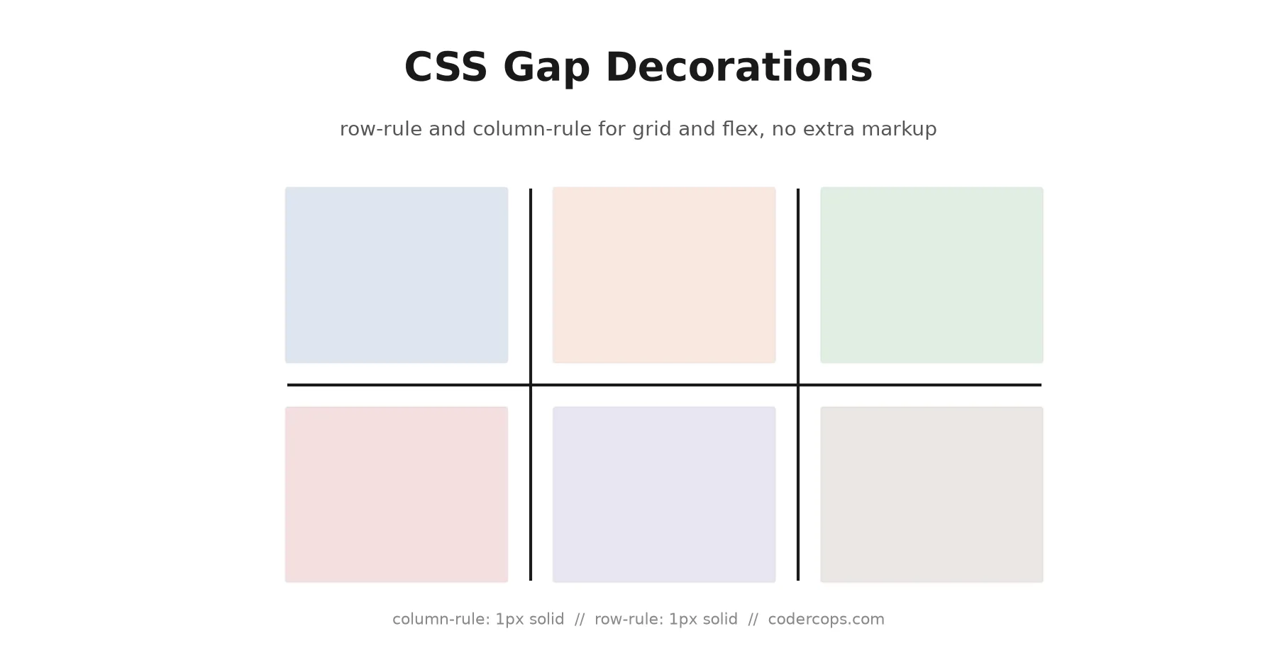
Every developer has built the same thing at least once: a row of pricing cards or nav items with a thin vertical line between each one, and no line before the first or after the last. The usual fix is a pseudo-element with a border-left, careful :not(:last-child) targeting, or an extra wrapper div per item just to hold a divider. Gap decorations replace all of that with two lines of CSS: column-rule for vertical dividers, and a new row-rule property for horizontal ones, both drawn directly inside the gap you already have.
Why this needed a new feature at all
column-rule has existed for over a decade, but only for CSS multi-column layout, the column-count / column-width mode used for things like a newspaper-style text layout. It never worked in grid or flexbox, which is where most developers actually reach for dividers between items. Gap decorations close that gap (pun acknowledged): the same column-rule property now works in grid and flex containers, and a matching row-rule property handles the horizontal case that multi-column never needed.
The basic syntax
If you already know border, you already know this:
.card-grid {
  display: grid;
  grid-template-columns: repeat(3, 1fr);
  gap: 24px;
  column-rule: 1px solid #e2e2e2;
  row-rule: 1px solid #e2e2e2;
}
That’s the entire implementation for a grid of cards with thin dividers between every column and every row, no pseudo-elements, no :not(:last-child) selectors, no extra markup. The rule is drawn centered in the gap and doesn’t change the gap’s width or height; if you want more space around the line, increase gap, not the rule’s own width.
It works the same way in flexbox:
.toolbar {
  display: flex;
  gap: 12px;
  column-rule: 1px solid var(--border-subtle);
}
A toolbar with icon buttons and a divider between each one, again with zero extra DOM nodes.
Patterning rules with repeat()
The part that goes beyond what border could ever do: gap decorations support repeat(), the same pattern-repeating syntax grid-template-columns uses, so you can vary the rule across the container in one declaration.
.stats-row {
  display: grid;
  grid-template-columns: repeat(6, 1fr);
  gap: 16px;
  column-rule: repeat(2, 1px solid #ddd) 2px solid #999;
}
That draws a light 1px divider after the first two gaps, then a heavier 2px divider, then repeats the pattern across the rest of the row. Building the equivalent with pseudo-elements means hand-writing :nth-child() selectors for every position in the pattern; here it’s one declaration that describes the pattern once.
Finer control: breaks and outsets
Two properties matter once you start using gap decorations on real layouts instead of a demo grid.
column-rule-break and row-rule-break control what happens where a column rule and a row rule would otherwise cross, in a grid with dividers in both directions. The default renders a continuous crossing; setting a break gives you a cleaner intersection where the lines don’t visually overlap.
column-rule-outset and row-rule-outset extend a rule beyond the edge of the grid or flex container, useful when you want a divider to bleed into the container’s padding rather than stopping exactly at the content edge, a common design ask that used to mean a fussy pseudo-element with negative margins.
.data-table-grid {
  display: grid;
  grid-template-columns: repeat(4, 1fr);
  gap: 20px;
  row-rule: 1px solid #eee;
  column-rule: 1px solid #eee;
  row-rule-break: spanning-item;
  column-rule-outset: 8px;
}
Browser support: this is Chromium-only right now
Gap decorations shipped in Chrome and Edge starting with version 149. As of September 2026, that’s the extent of it: Firefox and Safari haven’t implemented it, and there’s no confirmed timeline from either engine for when they will. A polyfill is reportedly in development for browsers without native support, but nothing production-ready has shipped yet.
That makes this a progressive-enhancement feature today, not a drop-in replacement for your existing divider approach. Wrap it behind @supports:
.card-grid {
  /* Fallback: pseudo-element dividers, works everywhere */
}
.card-grid > .card:not(:last-child)::after {
  content: "";
  position: absolute;
  /* ...existing pseudo-element divider styles */
}

@supports (column-rule: 1px solid black) and (row-rule: 1px solid black) {
  .card-grid {
    column-rule: 1px solid #e2e2e2;
    row-rule: 1px solid #e2e2e2;
  }
  .card-grid > .card:not(:last-child)::after {
    content: none; /* let the native rule take over where it's supported */
  }
}
Chrome and Edge users get the simpler, DOM-free version; everyone else gets what they were already getting. Nothing breaks either way, which is the whole point of feature-querying a CSS property that isn’t universally shipped yet. For a broader read on which recent CSS features are actually safe to reach for versus which are still Chromium exclusives, we cover the wider landscape in our state of CSS in 2026 roundup.
Where this is worth adopting now
If your project already targets Chromium-only environments, an internal admin tool, an Electron app, a Chrome extension, gap decorations are safe to use directly today and will simplify a real amount of CSS. For anything shipping to the open web, treat it the way you’d treat any Chromium-first feature: build the fallback first, add the enhancement behind @supports, and stop maintaining the pseudo-element version once Firefox and Safari catch up. Given how much boilerplate this replaces (a pseudo-element per divider, careful :not() targeting, negative-margin outsets), it’s worth having the @supports block ready now so you can delete the fallback the moment support is broad enough, rather than retrofitting it later.
Frequently asked questions
- What is CSS gap decorations?
- A CSS feature that lets you draw decorative lines in the gaps between grid, flexbox, and multi-column items using column-rule and a new row-rule property, the same way column-rule already worked for CSS multi-column layout. The lines are purely visual and don't affect the layout's sizing.
- Does row-rule or column-rule change my gap size?
- No. The rule is drawn centered inside the existing gap; it doesn't add width or height to the gap itself. If you want more visual breathing room around the line, increase gap, not the rule width.
- Can I style every other divider differently?
- Yes, using repeat() in the rule value, the same pattern-repeating syntax grid-template-columns uses. You can target specific gap positions and give them a different width, style, or color than the rest.
- Do I still need pseudo-element dividers for browsers that don't support this yet?
- Yes, as of September 2026. Gap decorations only ship in Chrome and Edge 149 and later. Firefox and Safari haven't implemented it. Wrap the new properties in an @supports block and keep your existing pseudo-element or border-based dividers as the fallback until support is broader.
- Does gap decorations work with flexbox, not just grid?
- Yes. It works across grid, flexbox, and multi-column layout, which is new: column-rule previously only applied to CSS multi-column (the column-count/column-width layout mode), not to grid or flex containers.
Sources
Sponsored
More from this category
More from Web Development
Sponsored
Discussion
Join the conversation.
Comments are powered by GitHub Discussions. Sign in with your GitHub account to leave a comment.
Sponsored