Web Development · CSS
CSS base-select: Styling the Native Dropdown
One CSS property finally styles the browser's own select, options and icons included, with no dropdown library. The syntax, an example, and real support.

Abhishek Gupta
5 min read
Sponsored
Styling a native <select> dropdown has been one of CSS’s oldest unsolved problems. You could style the closed box well enough, but the open dropdown list was an OS-drawn popup that CSS couldn’t touch, which is exactly why every design system ships a JavaScript-built replacement instead. appearance: base-select finally closes that gap: it’s a CSS property that opts a native <select> into a fully styleable state, icons in the options included, while keeping every bit of the accessibility and keyboard behavior the browser already got right.
The problem this actually solves
A hand-built dropdown component, the kind every component library ships, has to reimplement everything a native <select> already does for free: trapping focus while open, closing on Escape and outside click, arrow-key navigation between options, typeahead search when you start typing a letter, and the ARIA roles and states that make all of that legible to a screen reader. Get any one of those subtly wrong, which is easy to do, and you’ve shipped a dropdown that’s worse for keyboard and screen reader users than the plain <select> you replaced. appearance: base-select sidesteps the whole problem: you’re not rebuilding the interaction model, you’re styling the browser’s own implementation of it.
The syntax
Two selectors need the property, one for the element itself and one for its popup:
select,
::picker(select) {
  appearance: base-select;
}
That single rule switches the select’s rendering model. Nothing else about your markup needs to change for a plain text dropdown to start accepting styles it couldn’t before, borders, background, padding on individual options, hover and focus states on each option, all now fair game with ordinary CSS.
Putting real content inside the trigger and the options
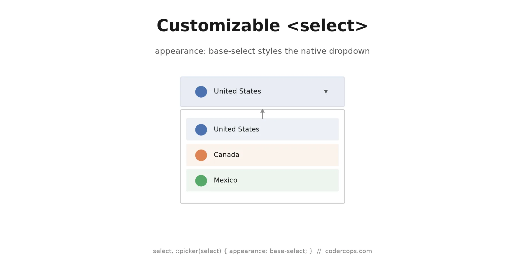
The bigger change is markup, not just styling. To control exactly what shows in the closed select (not just the selected option’s text), wrap it in a <button> with a <selectedcontent> element:
<select>
  <button>
    <selectedcontent></selectedcontent>
  </button>
  <option value="us">
    <img src="/flags/us.svg" alt="" width="20" />
    United States
  </option>
  <option value="ca">
    <img src="/flags/ca.svg" alt="" width="20" />
    Canada
  </option>
  <option value="mx">
    <img src="/flags/mx.svg" alt="" width="20" />
    Mexico
  </option>
</select>select,
::picker(select) {
appearance: base-select;
}
select {
display: flex;
align-items: center;
gap: 0.5rem;
padding: 0.5rem 0.75rem;
border: 1px solid #d0d0d0;
border-radius: 6px;
}
option {
display: flex;
align-items: center;
gap: 0.5rem;
padding: 0.5rem 0.75rem;
}
option:hover,
option:focus {
background: #f0f4ff;
}<selectedcontent> automatically mirrors whatever the currently selected <option> contains, flag image included, so the closed select shows the same icon-plus-label pairing as the open list. Before this feature, getting a flag icon into a native select’s closed state required a JavaScript-rendered fake trigger sitting on top of a hidden real select, purely for accessibility fallback. Now it’s the actual select.
Styling the dropdown arrow
The little arrow icon that indicates open/closed state is its own targetable pseudo-element, ::picker-icon, which means you can animate it instead of swapping an SVG with JavaScript:
select::picker-icon {
  transition: rotate 0.2s ease;
}

select:open::picker-icon {
  rotate: 180deg;
}
select:open is a state selector that matches while the dropdown is expanded, the same shape as :open on <details>, so you get the rotate-on-open animation without any script tracking open state on your own.
What browsers actually support this
This is the part to be honest about before reaching for it on anything user-facing. appearance: base-select is stable in Chrome and Edge starting with version 135. As of September 2026, Safari has it behind Technology Preview (not yet in a shipping stable release) and Firefox is prototyping it behind a flag in Nightly builds. It is not Baseline, meaning it doesn’t yet work in the current stable release of every major engine.
The good news is that the failure mode is graceful by design. appearance: base-select is additive: a <select> styled with it, viewed in a browser that doesn’t recognize the property, just renders as a normal, unstyled native select. Nothing crashes, nothing loses functionality, the icons and custom styling simply don’t apply. That makes it safe to ship today as a Chromium-only enhancement layered on top of a select that already works everywhere, rather than something you have to gate behind a browser check.
/* Works everywhere as a plain select; Chromium 135+ gets the styled version */
select,
::picker(select) {
  appearance: base-select;
}
No @supports wrapper is strictly required here the way it was for gap decorations, because there’s no visual regression to guard against in unsupported browsers, just a plainer select than the one Chrome and Edge users see.
Should you use this instead of your component library’s dropdown?
If your team maintains a custom-built select component today specifically to get icons or rich content into the options, this is worth evaluating as a replacement, starting with a low-stakes instance like a settings page or an internal tool, since Safari and Firefox users will simply see the native fallback rather than a broken experience. For anything where pixel-identical rendering across every browser is a hard requirement right now, hold off until Safari and Firefox ship stable support; a design that looks intentionally different in Chromium versus Firefox is a real product decision, not a bug, but it needs to be one your team makes on purpose. We’ve written more broadly about deciding when to adopt a browser feature that’s still short of full support in our state of CSS in 2026 roundup, and the same adopt-behind-a-flag logic from our CSS gap decorations piece applies here too: ship it as an enhancement, not a dependency, until the browser matrix catches up.
Frequently asked questions
- What does appearance: base-select actually do?
- It switches a native <select> element from an opaque, OS-drawn widget into a normal element tree that CSS can target directly, styling the trigger, the popup, individual options, and the open/closed states, while keeping the browser's built-in keyboard navigation, focus handling, and accessibility tree intact.
- Do I still get keyboard navigation and screen reader support?
- Yes, and that's the point of the feature. You're styling the browser's native select, not replacing it with a div-based widget, so arrow-key navigation, typeahead, and the accessibility semantics screen readers rely on keep working without you reimplementing any of it.
- Can I put an image or icon next to each option?
- Yes. Once appearance: base-select is set, <option> elements can contain real markup, images, icons, spans, not just plain text, and it renders as written. That was not possible with a standard select before this feature.
- Is appearance: base-select safe to use in production right now?
- With a fallback plan, yes. It's stable in Chrome and Edge 135 and later. Firefox and Safari don't support it yet, but because the feature is additive, a select without this CSS applied just renders as a normal native dropdown in those browsers, so nothing breaks. Treat it as progressive enhancement, not a feature you can rely on rendering identically everywhere.
- How is this different from a JavaScript-built custom dropdown component?
- A JS-built dropdown reimplements everything from scratch: focus trapping, keyboard navigation, ARIA roles, positioning, and it's easy to get subtly wrong in ways that break for screen reader or keyboard users. appearance: base-select styles the browser's own select, which already gets all of that right, so you inherit correct behavior instead of rebuilding it.
Sources
Sponsored
More from this category
More from Web Development
Sponsored
Discussion
Join the conversation.
Comments are powered by GitHub Discussions. Sign in with your GitHub account to leave a comment.
Sponsored