Web Development · CSS
CSS :open Is Baseline: One Selector for Toggles
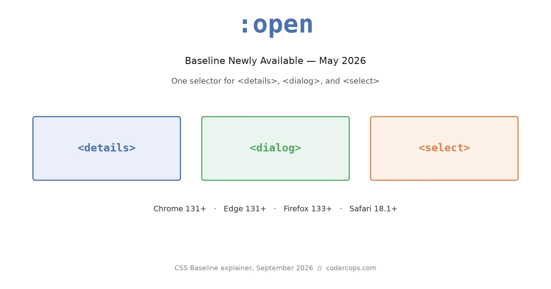
The :open pseudo-class, Baseline since May 2026, styles <details>, <dialog>, and <select> in their expanded state with one selector. No JS classes needed.

Abhishek Gupta
6 min read
Sponsored
Every <details> dropdown, custom <select>, and <dialog> on the web has an open state and a closed state, and until recently, styling the difference meant JavaScript: a listener, a toggled class, a bit of state to keep in sync with what the browser already knew perfectly well on its own. As of May 2026, it doesn’t. :open is Baseline Newly Available in Chrome, Edge, Firefox, and Safari, and it matches exactly what its name says: any native element that’s currently open.
What it matches
The :open pseudo-class selects any HTML element with a native open and closed state, for as long as it’s open: <details>, <dialog>, native <select>, and <input type="color"> or <input type="date"> while their built-in pickers are visible. It’s Baseline Newly Available since May 2026, supported in Chrome 131+, Edge 131+, Firefox 133+, and Safari 18.1+.
In practice it looks like this:
details:open > summary {
  font-weight: 700;
}

dialog:open {
  border-color: var(--accent);
}

select:open {
  background-color: var(--surface-highlight);
}
That’s <details>, <dialog>, native <select>, and the built-in pickers on <input type="color"> and <input type="date"> while they’re showing. Nothing exotic, nothing that needs a polyfill to understand what “open” means, because every one of those elements already tracked that state internally. :open just gives CSS a way to ask.
For <details> specifically, this isn’t new behavior, it’s a cleaner syntax for something the [open] attribute selector already did. details[open] > summary and details:open > summary do the same thing today. The difference shows up on <select>, where there was no equivalent attribute selector at all before :open arrived, and on <dialog>, where [open] technically works but reads oddly for an element whose open state is more commonly set via .showModal() than by hand-toggling an attribute. MDN’s reference page has the full element list and edge cases if you’re checking whether a specific control you’re styling qualifies.
:open is part of a broader wave of Baseline 2026 CSS that quietly deletes JavaScript rather than adding new visual capability. We’ve covered a few of the others separately: contrast-color() for computing readable text against a background you don’t control at author time, and @scope for style isolation without a build step. None of these are flashy on their own. Together they’re a meaningful shrinking of the gap between “what CSS can express” and “what used to require a few lines of JavaScript just to keep a class name in sync with the DOM.”
The part people get wrong: :open vs :popover-open
These look like siblings and aren’t quite. :open matches native open/closed elements. :popover-open matches an element carrying the popover attribute while it’s currently shown via the Popover API. A <dialog> opened with .showModal() matches :open, not :popover-open. A <div popover> toggled open matches :popover-open, not :open. They don’t fall back to each other, and picking the wrong one silently does nothing, since an unmatched selector doesn’t throw, it just never applies.
If you’re not sure which one your component needs, it comes down to how you built it: native elements with their own semantics (<details>, <dialog>, <select>) get :open. Anything using the popover attribute gets :popover-open. There’s no case where you need both on the same element, because an element is either a native open/closed control or a popover, not both at once. web.dev’s walkthrough of dialog and popover as Baseline-layered UI patterns is worth a read if you’re deciding which mechanism to build a given component on in the first place, before you get to styling it.
A real example: styling a custom select without JavaScript
Native <select> styling has historically meant either accepting the browser’s default chrome or reaching for appearance: none plus a hand-rolled dropdown indicator, with a JavaScript-toggled class to flip that indicator when the dropdown opens. :open removes the JavaScript half of that:
select {
  appearance: none;
  padding: 0.5em 2em 0.5em 0.75em;
  border: 1px solid var(--border);
  background: var(--surface) url("chevron-down.svg") no-repeat right 0.6em center / 1em;
}

select:open {
  background-image: url("chevron-up.svg");
  border-color: var(--accent);
}

label:has(select:open) {
  color: var(--accent);
}
The last rule is the one worth sitting with. label:has(select:open) reaches from a parent <label> into its descendant <select>’s open state, no listener, no ARIA attribute mirroring, no aria-expanded sync logic living in a component’s JavaScript just to keep a label’s color honest. :has() reached Baseline back in late 2023; pairing it with :open in 2026 means a whole class of “parent reacts to child’s interactive state” styling that used to require a framework’s reactivity system now runs as a plain CSS selector.
What it doesn’t do
:open tells you whether something is open. It doesn’t animate the transition between states on its own. A <details> element’s content area doesn’t have a natural height to transition between “0” and “however tall the content is” without either the interpolate-size property (itself a newer, less broadly supported feature) or a JavaScript-measured height. :open fixes the “which class do I toggle” problem, not the “how do I animate this open” problem. Keep your existing animation approach; just delete the class-toggling logic feeding into it, if that’s the only reason you had a listener.
It also doesn’t retroactively make older browsers understand it. Baseline Newly Available means Chrome 131+, Edge 131+, Firefox 133+, and Safari 18.1+ all ship support as of May 2026, which is recent enough that a meaningful slice of real-world traffic, especially on older iOS Safari versions, won’t have it yet. Wrap new :open-dependent styling in @supports selector(:open) and keep the [open] attribute selector as a fallback for <details> and <dialog>, since that one has worked in every browser for over a decade. There’s no safe fallback for select:open specifically, since there was never an equivalent selector before it; on unsupported browsers, that particular rule just won’t apply, and the browser’s default <select> chrome takes over instead, which is a reasonable degradation, not a broken one.
If you’re auditing a design system for what’s safe to ship without a build-time feature flag, this is the kind of small, unglamorous addition worth actually adopting rather than filing away as “check back later.” It removes real code, not hypothetical code, and the fallback path for the elements it fixes was never worse than a default the browser already handles. For component libraries specifically, that’s the whole argument: fewer states to track in JavaScript means fewer states that can drift out of sync with what the DOM actually says.
Frequently asked questions
- What does :open actually select?
- Any element with a native open and closed state, while it's currently open. In practice that's <details> (with the open attribute set), <dialog> (shown via .show() or .showModal()), native <select> (while its dropdown is expanded), and <input type="color"> or <input type="date"> while their built-in pickers are visible. It does not match custom components you've built yourself unless they use one of those underlying elements.
- Is :open the same as :popover-open?
- No, and mixing them up is the most common mistake. :popover-open matches an element with the popover attribute while it's showing. :open matches native elements with their own open/closed semantics, like <details> and <dialog>. A <dialog> shown as a modal matches :open; an element toggled via the Popover API matches :popover-open. Use whichever matches how you built the component, not whichever name sounds closer to what you want.
- Which browsers support :open right now?
- All four major engines, as of Baseline Newly Available status in May 2026: Chrome 131+, Edge 131+, Firefox 133+, and Safari 18.1+. If your analytics show meaningful traffic on older versions, wrap new :open-only styling in @supports selector(:open) and keep a [open] attribute selector as the fallback for <details> and <dialog>, since that attribute has worked everywhere for years.
- Does :open replace the JavaScript I use to toggle a chevron icon or highlight state?
- For native elements, usually yes. If your only reason for a toggle-driven JavaScript class was to flip an icon, a background color, or a border when a <details>, <dialog>, or <select> opens, :open (or the older [open] attribute selector for <details> and <dialog> specifically) does the same job without a listener, a class name to keep in sync, or a re-render. It doesn't replace JavaScript you need for other reasons, like animating height on <details>, which still needs help since open/closed is a binary attribute, not an animatable value on its own.
- Can I combine :open with :has() to style a parent based on a child's state?
- Yes, and that's one of the more useful patterns. label:has(select:open) lets a <label> change appearance while its associated <select> dropdown is open, without JavaScript tracking focus or open state anywhere. The same pattern works for a form row wrapping a <details> or highlighting a fieldset while a date picker inside it is active.
Sources
Sponsored
More from this category
More from Web Development
Sponsored
Discussion
Join the conversation.
Comments are powered by GitHub Discussions. Sign in with your GitHub account to leave a comment.
Sponsored